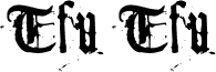
Tfu Tfu, di Meir Sadan, è un carattere display blackletter gratuito che evoca un sapore medievale, brusco e usurato. Le lettere richiamano le forme gotiche tradizionali, ma i bordi scheggiati e le fratture irregolari evitano che il risultato appaia cerimonioso: il look è grezzo, macchiato e un po' dirompente.
Ciò rende questo font gratuito una scelta ideale per titoli su poster, copertine di fanzine, loghi di band, titoli di testa e packaging che puntano a un'atmosfera storica cupa, senza apparire troppo curata o ornamentale. Funziona al meglio dove poche parole possono valorizzare la texture, specialmente in titoli brevi o iniziali in stile monogramma, perché le forme blackletter maltrattate comunicano già gran parte del carattere.
My kitty can make fonts. One day I was hanging around with my lovely kitty-cat, browsing different types of fonts. My kitty surprisingly started to stare at each typeface, examining its typographical correctness and structure, the serifs and the stroke angle. Suddenly, she meowed. It wasn't the regular kind of meow - it was her special meow. The meow she uses to greet people she likes... At that moment, it just hit my mind - my kitty happens to like Goudy's typeface.
Goudy is that font on the cover of The New York Times... The one that says "The New York Times". Yeah. Anyways... My kitty seemed to get all giddy and stuff, so I made a printout of it and let my kitty play with it.
In a very extreme measure of carefulness, she started toodling around with the font - scrach here, scratch there - wrinkle here, wrinkle there. She started to get bored from this routine quite fastly, so I took the poor piece of paper and rolled it to the shape of the ball. You should've seen the look of graditude on her face when she found out she could now both play and make a font at the same time!
To make a long story short, I eventually took the wad of material previously known as a piece of paper and scanned it into a font. And now you can have it. So there.
Informazioni estese sul font
Piattaforme supportate
PiattaformaCodifica
UnicodeUnicode 1.0 semantica
MacintoshRomano
MicrosoftUnicode BMP solo
Dettagli del font
Creato1998-12-16
Revisione1
Numero di glifi102
Unità per em1300
Diritti di incorporamentoIncorporamento limitato (non consentito)
Classe della famigliaNessuna classificazione
PesoNormale
LarghezzaNormale
Tipo di larghezzaNormale
Stile MacGrassetto
DirezioneSolo fortemente sinistra a destra glifi + contiene neutrali