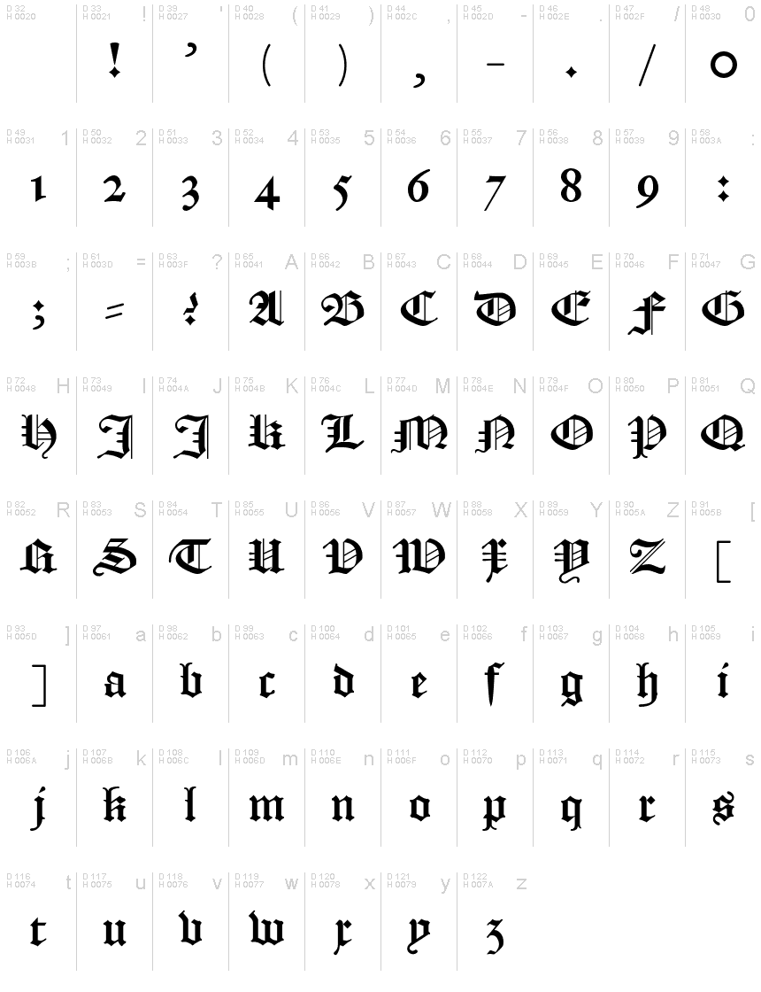
Textura Belgica
TrueTypeFreeware
TexturaBelgica.ttf
Tag
Nota dell'autore
Textura Belgica, the stunning gothic font designed by Jozef Herrebrugh, is the epitome of medieval style. Its intricate lines and sharp edges make it perfect for projects that require a touch of old-world charm. Whether you're designing a poster for a Renaissance fair or creating invitations for a medieval-themed wedding, Textura Belgica's semi-bold font and narrow width will add sophistication and elegance to your work. This typeface is also ideal for logos and branding materials that need to convey a sense of history and authenticity. Give your designs an air of timeless beauty with Textura Belgica.
The terror of many a student of Dutch Language and Culture! Textura Belgica is a true to tradition digitalisation of the blackletter type as it was used from the 16th into the 20th century in the Dutch language area.
With 'true to tradition' is meant that, in this font, differently from many other blackletter fonts you can find online, there is full support for the special characters you need to make your personal facsimiles!
This font had been digitalised using a high-resolution scan of a sheet with all letters, as made by type cutter and founder Hendrick van den Keere, from Gent in the 16th century. Beside this sheet, which I used as a base, I used:
- scans of the Dutch 'States Translation' of the Bible from 1637 (https://www.bijbelsdigitaal.nl/view/?bible=sv1637);
- via Google Books 'Verbael van 't Verhandelde over de Gravamina, Kerckelijke swaricheden tot Rotterdam, Oudewater, etc.' (https://books.google.nl/books?id=zRZjAAAAcAAJ&printsec=frontcover&);
- my own little private collection (two Bibles, early 19th and end 18th century, and a catechism, second half 18th century).
I have called this font 'Textura Belgica' as the term 'Belgica' during the 'golden age' of this type of font was used as the Latin name of all the Netherlands (equivalent in area with the modern Benelux). For example, the Latin name of the Dutch colony New Netherland was 'Nova Belgica'.
Mappa caratteri
Si prega di utilizzare il menu a tendina per visualizzare le mappe di caratteri diversi contenuti in questo tipo di font.

Informazioni di base caratteri
Font famiglia
Textura Belgica
Font sottofamiglia
Regular
Nome completo del font
Textura Belgica
Nome tabella versione
Version
Postscript nome del font
TexturaBelgica
Informazioni estese caratteri
Piattaforme supportate
PiattaformaCodifica
UnicodeUnicode 2.0 e poi semantica, unicode BMP solo
MacintoshRomano
MicrosoftUnicode BMP solo
Dettagli carattere
Creato2021-10-26
Revisione1
Contatore glifi110
Unità per em4096
Incorporare i dirittiIncorporamento per l'installazione permanente
Classe famigliaNessuna classificazione
PesoNormale
AltezzaNormale
Mac styleGrassetto
DirezioneSolo fortemente sinistra a destra glifi + contiene neutrali
Disegno naturaRegolari
InclinazioneVario