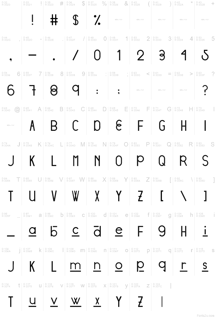
Stratford Sans
TrueTypeDemo
- Euro
Stratford Sans - DEMO.ttf
Tag
Nota dell'autore
DESIGNED BY: Victoria Vandenberg from @BonaFideCraft
The objective of Stratford Sans was to pull from both ends of the spectrum through combining vintage + modern typographic elements to create a font that would seamlessly amalgamate itself into the story of your designs.
Design Process
The initial design process pulled from finding a voice for the city of Stratford, Ontario. The city has a strong scene of traditional arts + culture and is focused on adding digital culture + flair to the mix. The city is expressive, traditional, and unexpected. Therefore, elements tipping a hat to traditional British letterforms and the fluid combination of grotesque era ovals and unforeseen hints of geometric characters are what truly send Stratford Sans into a realm of its own.
The initial design decision was that Stratford Sans would, in fact, be a sans serif font. This is to pull away from its branding of traditional arts and giving it the opportunity to newly define itself, whilst still allowing the magic that is its history, to seep through its characters. Interlacing two conflicting themes gives you the ability to craft a harmony between the two: to pull the exciting and non-negotiable defining elements of each - and defining a new sensation.
Mappa caratteri
Si prega di utilizzare il menu a tendina per visualizzare le mappe di caratteri diversi contenuti in questo tipo di font.

Informazioni di base caratteri
Dichiarazione di Copyright
Copyright (c) 2018 by Victoria Vandenberg - Bona Fide Craft. All rights reserved.
Font famiglia
Stratford
Font sottofamiglia
Regular
Sottofamiglia unico di identificazione
VictoriaVandenberg-BonaFideCraft: Stratford Sans: 2018
Nome completo del font
Stratford Sans
Postscript nome del font
Stratford Sans
Marchi di fabbrica
Stratford Sans is a trademark of Victoria Vandenberg - Bona Fide Craft.
Fabbricante
Victoria Vandenberg - Bona Fide Craft
Progettista
Descrizione
Copyright (c) 2018 by Victoria Vandenberg - Bona Fide Craft. All rights reserved.
Informazioni estese caratteri
Piattaforme supportate
PiattaformaCodifica
UnicodeUnicode 2.0 e poi semantica, unicode BMP solo
MacintoshRomano
MicrosoftUnicode BMP solo
Dettagli carattere
Creato1969-12-31
Revisione1
Contatore glifi95
Unità per em1000
Incorporare i dirittiIncorporamento per anteprima di stmapa consentito
Classe famigliaNessuna classificazione
PesoMedio leggero
AltezzaNormale
Mac styleGrassetto
DirezioneSolo fortemente sinistra a destra glifi + contiene neutrali
Disegno naturaRegolari
InclinazioneVario