Skratch Punk
OpenTypeUso personale
- Accenti (parziale)
- Accenti (completo)
- Euro
- Emoticons
- Simboli di carte da gioco
- Musica
Skratch_Punk.otf
Tag
Nota dell'autore
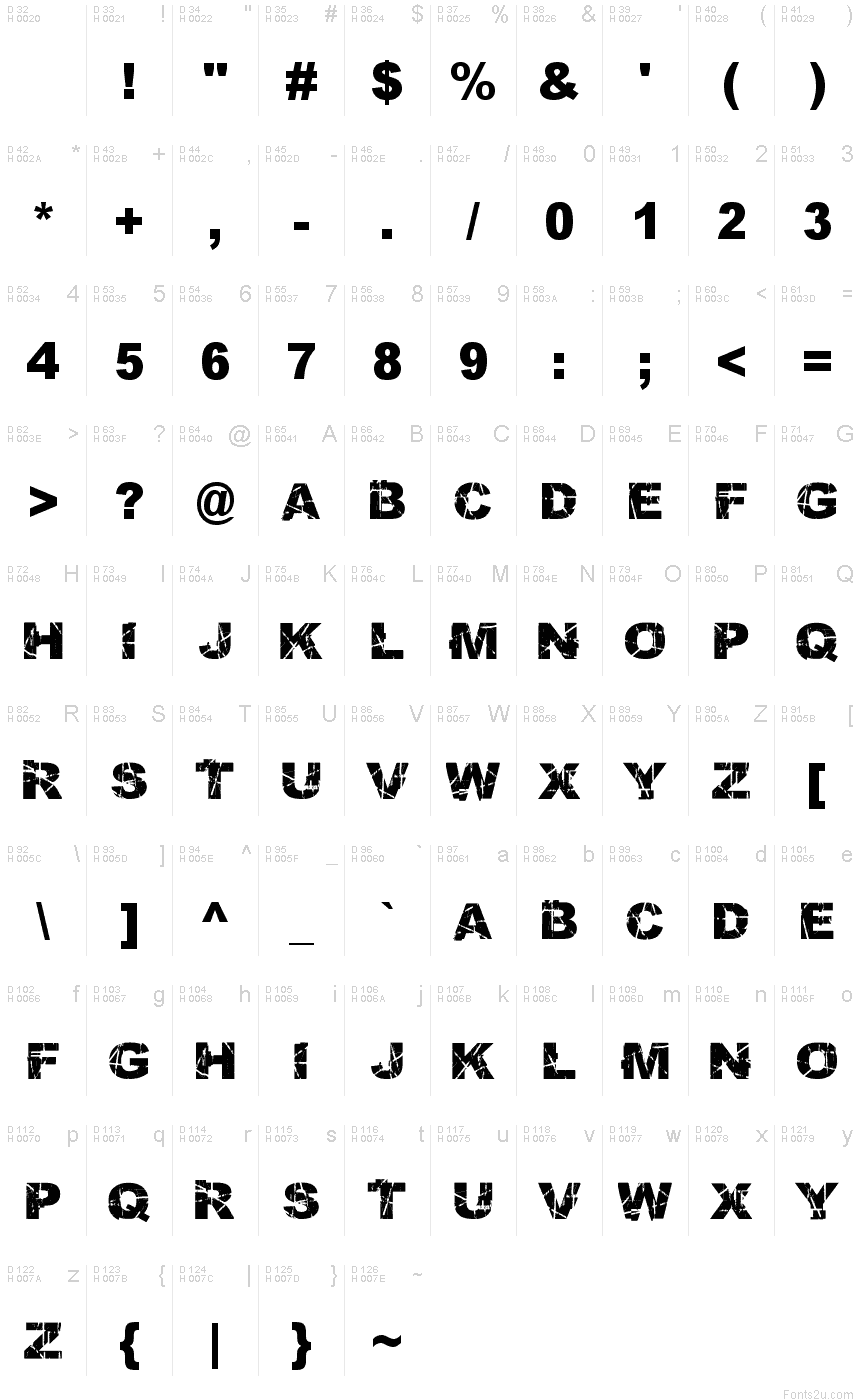
Skratch Punk font by Robin Nicholas, Patricia Saunders of Nik Coley is a free eroded display typeface that looks like it’s been hacked together with photocopiers, box cutters, and spray paint. Chunky, tightly packed letters are ripped with scratches and gaps, so the black shapes feel loud, chaotic, and a little dangerous-like a band flyer stapled to a brick wall. Despite the destruction, the overall rhythm stays surprisingly readable, especially at big sizes.
Using Skratch Punk, you can push attitude straight into gig posters, album covers, streetwear graphics, skateboard decks, zines, and protest visuals. This free font thrives when you blow it up huge and let the distressed texture really bite into the page or screen. For supporting text, pair it with a plain, narrow sans serif to keep the noise where it belongs: in the headline.
--
Mappa caratteri
Si prega di utilizzare il menu a tendina per visualizzare le mappe di caratteri diversi contenuti in questo tipo di font.

Informazioni di base caratteri
Dichiarazione di Copyright
Copyright 2006 by Nik Coley.
Font famiglia
Skratch Punk
Font sottofamiglia
Normale
Sottofamiglia unico di identificazione
Skratch Punk:Version 1.0
Nome completo del font
Skratch Punk
Nome tabella versione
Version 1.0 May 17, 2006
Postscript nome del font
SkratchPunk
Fabbricante
Progettista
Descrizione
Monotype Drawing Office 1982. A contemporary sans serif design, Arial contains more humanist characteristics than many of its predecessors and as such is more in tune with the mood of the last decades of the twentieth century. The overall treatment of curves is softer and fuller than in most industrial-style sans serif faces. Terminal strokes are cut on the diagonal which helps to give the face a less mechanical appearance. Arial is an extremely versatile family of typefaces which can be used with equal success for text setting in reports, presentations, magazines etc, and for display use in newspapers, advertising and promotions.
Informazioni estese caratteri
Piattaforme supportate
PiattaformaCodifica
MicrosoftUnicode BMP solo
MacintoshRomano
Dettagli carattere
Creato1991-11-21
Revisione2
Contatore glifi660
Unità per em2048
Incorporare i dirittiIncorporamento per l'installazione permanente
Classe famigliaSenza terminazioni
PesoGrassetto
AltezzaMedio espanso
Mac styleGrassetto
DirezioneSolo fortemente sinistra a destra glifi
Disegno naturaRegolari
InclinazioneVario