Sabor Digital
TrueTypeUso personale
- Accenti (parziale)
- Euro
Sabor Digital.ttf
Tag
Nota dell'autore
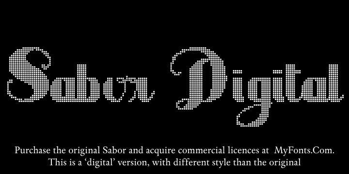
Sabor Digital is a non-commercial version, with different layout style than the original, Sabor, by Intellecta Design. To purchase the original Sabor (seven fonts in the family) and commercial licences, please, visit: http://www.myfonts.com/fonts/intellecta/sabor/
Visit my commercial library : http://new.myfonts.com/foundry/Intellecta_Design/?refby=paulow
INTELLECTA DESIGN makes research and development of fonts with historical and artistical relevant forms. This font is a FREE software for personal and non-commercial use only. But donations for my HISTORICAL STUDIES about the history of the letters, calligraphy and typography are accept ed. Thi s font is for unlimi te d distribution, since attac hed in a file zip t o gether with this t ext . For co mmercial use you need register this software by sending U$ 15,00 to the following paypal account - estiliza@gmail.com - After that, you need sent me a e-mail (paulo.w.designer@gmail.com), so I will send to you a legal permission to use the font.
DRINKWARE ARE WELCOME !!!!
If you want to use this font FULL LIFE without any restrictions, you can also place a link to my site in your website. If you create any work of artistic nature with this font, I will be glad to publish it in social networks. See my entire profesional commercial font library (OVER 500 FONTS) at http://new.myfonts.com/search/intellecta/fonts/?sort=sales?refby=paulow
sincerely, Paulo W
Donations are appreciated!
==================================================================================
ABOUT THE ORIGINAL SABOR FONT:
Sabor is a voluptuous upright connected display font with mixed taste of script fonts. There were many inspirations for Sabor, but all started with a book from the 1950s about the battles of War War II. To that first sketches of a naive dense display typeface we, day by day, start to create a mixed style evolving some lettering concepts from 1950s, some calligraphy notions and the first display ideas. The feeling of this font is good to be used in many artworks, like logos, packaging, party invitations, layouts for t-shirts, magazine headings, and much more, since websites to and all kind of printed jobs.
That font is not really a script, but, like the scripts we strongly recommends to use the caps only in the begining of words and sentences, to contrast with the lower cases : its not designed for all-caps settings, so avoid that kind of use.
This font has almost 700 glyphs and supports the most important Latin-based languages. We works hard in a tour-de-force kerning: over 12.000 kerning pairs soft adjusted handly. Its OpenType features include final forms, initial forms, special sets (upper and lowercases), hundreds of contextual alternates ligatures providing letterform variations and concetions that make your designs really special, and ornaments (tails).
Because of its high number of alternate letters and combinations, we suggest the use of the glyph palette to find ideal solutions to specific designs. The sample illustrations will give you an idea of the possibilities. You have full access to this amazing stuff using InDesign, Illustrator, QuarkXpress and similar software. However, we still recommend exploring what this font has to offer using the glyphs palette: principally to get all the power of the Contextual Alternates feature. You can get an idea of the power of this font looking at the Sabor User Guide, a pdf brochure in the Gallery section.
Also available two sister fonts easy to use : SaborWords and SaborRasgosEscritura
Sabor has original letters designed by Iza W and overall creative direction plus core programming by Paulo W.
Visit my commercial library : http://new.myfonts.com/foundry/Intellecta_Design/?refby=paulow
INTELLECTA DESIGN makes research and development of fonts with historical and artistical relevant forms. This font is a FREE software for personal and non-commercial use only. But donations for my HISTORICAL STUDIES about the history of the letters, calligraphy and typography are accept ed. Thi s font is for unlimi te d distribution, since attac hed in a file zip t o gether with this t ext . For co mmercial use you need register this software by sending U$ 15,00 to the following paypal account - estiliza@gmail.com - After that, you need sent me a e-mail (paulo.w.designer@gmail.com), so I will send to you a legal permission to use the font.
DRINKWARE ARE WELCOME !!!!
If you want to use this font FULL LIFE without any restrictions, you can also place a link to my site in your website. If you create any work of artistic nature with this font, I will be glad to publish it in social networks. See my entire profesional commercial font library (OVER 500 FONTS) at http://new.myfonts.com/search/intellecta/fonts/?sort=sales?refby=paulow
sincerely, Paulo W
Donations are appreciated!
==================================================================================
ABOUT THE ORIGINAL SABOR FONT:
Sabor is a voluptuous upright connected display font with mixed taste of script fonts. There were many inspirations for Sabor, but all started with a book from the 1950s about the battles of War War II. To that first sketches of a naive dense display typeface we, day by day, start to create a mixed style evolving some lettering concepts from 1950s, some calligraphy notions and the first display ideas. The feeling of this font is good to be used in many artworks, like logos, packaging, party invitations, layouts for t-shirts, magazine headings, and much more, since websites to and all kind of printed jobs.
That font is not really a script, but, like the scripts we strongly recommends to use the caps only in the begining of words and sentences, to contrast with the lower cases : its not designed for all-caps settings, so avoid that kind of use.
This font has almost 700 glyphs and supports the most important Latin-based languages. We works hard in a tour-de-force kerning: over 12.000 kerning pairs soft adjusted handly. Its OpenType features include final forms, initial forms, special sets (upper and lowercases), hundreds of contextual alternates ligatures providing letterform variations and concetions that make your designs really special, and ornaments (tails).
Because of its high number of alternate letters and combinations, we suggest the use of the glyph palette to find ideal solutions to specific designs. The sample illustrations will give you an idea of the possibilities. You have full access to this amazing stuff using InDesign, Illustrator, QuarkXpress and similar software. However, we still recommend exploring what this font has to offer using the glyphs palette: principally to get all the power of the Contextual Alternates feature. You can get an idea of the power of this font looking at the Sabor User Guide, a pdf brochure in the Gallery section.
Also available two sister fonts easy to use : SaborWords and SaborRasgosEscritura
Sabor has original letters designed by Iza W and overall creative direction plus core programming by Paulo W.
Mappa caratteri
Si prega di utilizzare il menu a tendina per visualizzare le mappe di caratteri diversi contenuti in questo tipo di font.

Informazioni di base caratteri
Dichiarazione di Copyright
Copyright (c) 2012 by Iza and Paulo W, Intellecta Design. All rights reserved.
Font famiglia
Sabor Digital
Font sottofamiglia
Regular
Sottofamiglia unico di identificazione
IzaandPauloW,IntellectaDesign: Sabor Digital: 2012
Nome completo del font
Sabor Digital
Nome tabella versione
Version 3.005 2012
Postscript nome del font
SaborDigital
Marchi di fabbrica
Sabor Digital is a trademark of Iza and Paulo W, Intellecta Design.
Fabbricante
Iza and Paulo W, Intellecta Design
Descrizione
Copyright (c) 2012 by Iza and Paulo W, Intellecta Design. All rights reserved.
Informazioni estese caratteri
Piattaforme supportate
PiattaformaCodifica
UnicodeUnicode 2.0 e poi semantica, unicode BMP solo
MacintoshRomano
MicrosoftUnicode BMP solo
Dettagli carattere
Creato2012-05-02
Revisione3
Contatore glifi213
Unità per em1000
Incorporare i dirittiIncorporamento per l'installazione permanente
Classe famigliaNessuna classificazione
PesoGrassetto
AltezzaNormale
Tipo altezzaNormale
Mac styleGrassetto
DirezioneSolo fortemente sinistra a destra glifi + contiene neutrali
Disegno naturaRegolari
PosturaDritto
Peso colpoLibro, testo, regolare, etc.
InclinazioneVario