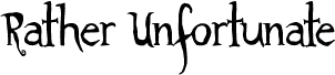
Rather Unfortunate is a free old-school decorative display font with lanky, uneven letters and a mischievous storybook air. Sharp points, bulbous curves, and recurring spiral tips give the lettering a deliberately unruly silhouette, like hand-cut title work from a strange theatrical poster.
It can turn a title into part of the illustration. That role makes it especially apt for Halloween posters, eccentric book covers, game graphics, and music merchandise, where the curling shapes support gothic comedy, dark fairy tales, or offbeat fantasy.
--
For personal use, please email me a copy of your work.
Commercial use requires a licensing agreement. Please contact me to discuss the cost.
A $1 donation for personal use may be sent to:
roxanne.michael@live.com.au
Rather Unfortunate is based on the movie A Series of Unfortunate Events.
Rather Unfortunate — Roxy Coppen, 2012