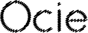
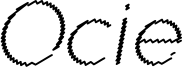
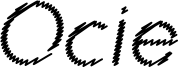
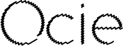
Ocie Normal is a captivating display font that exudes a sense of dynamic distortion. Designed by Louis Dorman, this typeface boasts a striking visual aesthetic, with its jagged, uneven strokes lending a sense of raw energy and movement. The irregular, almost glitch-like appearance of the letterforms creates a unique and eye-catching effect, making Ocie Normal an excellent choice for headings, titles, and design accents where a bold, attention-grabbing impact is desired.
Its versatility extends across various design applications, from branding and packaging to editorial layouts and digital interfaces, where its distinct character can add a compelling, disruptive element to the overall visual communication.
The font family presented is inspired by the conceptualization of user interface and user experience wireframe and storyboard sketches. It features a hand-lettered aesthetic, conveying a sense of organic, hand-crafted design elements. This font can be particularly useful for branding, display text, and creative project applications where a distinctive, handwritten-style typography is desired.