Moogalator Filler
TrueTypeGNU/GPL
- Accenti (parziale)
- Accenti (completo)
- Euro
MoogalatorFiller.ttf
Tag
Nota dell'autore
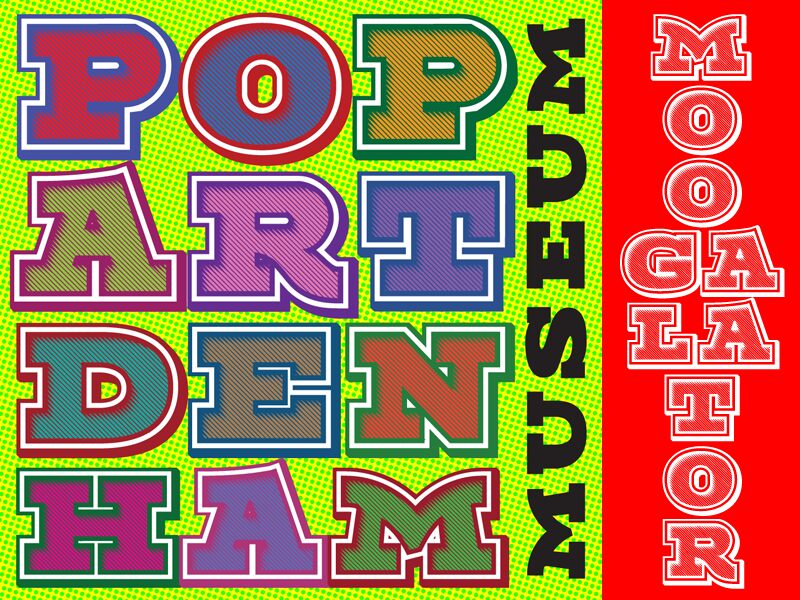
Moogalator Filler font by Tup Wanders is a display typeface that breathes retro aesthetics in its every curve and line. Its blocky structure adds boldness to every character while its solid surface draws inspiration from the mid-20th-century style. The expanded width makes it impossible to miss, suitable for when you want your words to be part of both worlds; vintage and modern.
Being a free display font, Moogalator Filler is perfect for lettering collection purposes as well as logo design ideas. Typographic posters, book cover art designs also benefit from both its geometric shapes and retro look. Other uses include magazine covers, movie posters, video game design ideas, greeting cards, social media promotional graphics, website headers, brochures.
--
I needed some letters with shading and decided to expand it into a full typeface. The bold slab serifs can create a sense of compression, causing some characters to appear squashed here and there. However, I believe there are those who will find it useful, and I had fun creating it.
The process turned out to be more challenging than I anticipated, particularly the shading; it took me an entire week to complete.
If you want to fill in the inside, you can duplicate your text in Moogalator and then change the font to Moogalator Filler. This should fit perfectly as all bearings and kerning are identical. Please refrain from using the Moogalator Filler as a standalone font; it was not designed for that purpose. It will result in poor aesthetics with bad kerning and lack of diacritics.
Mappa caratteri
Si prega di utilizzare il menu a tendina per visualizzare le mappe di caratteri diversi contenuti in questo tipo di font.

Informazioni di base caratteri
Dichiarazione di Copyright
Copyright 2025 Tup Wanders. All Rights Reserved.
Font famiglia
Moogalator Filler
Font sottofamiglia
Regular
Sottofamiglia unico di identificazione
Moogalator Filler Regular:Version 1.000
Nome completo del font
Moogalator Filler
Nome tabella versione
Version 1.000;February 11, 2025;FontCreator 15.0.0.3015 64-bit
Postscript nome del font
MoogalatorFiller-Regular
Marchi di fabbrica
nah.
Fabbricante
Progettista
Descrizione
Made by Tup Wanders in FontCreator 15 pro from High-Logic.com
Zou er ueberhaupt iemand zijn die beschrijvingen als deze leest? Het voelt enigszins als flessenpost of een balonnenwedstrijd. Het is maar afwachten waar het terechtkomt. Maar voor hetzelfde geld komt het op iedere downloadpagina terecht.
Hoe dan ook waarde lezer, wat nutteloze achtergrond bij dit lettertype: ik heb de regular en italic versie van Quaaykop in ongeveer anderhalve week gemaakt, tijdens een hittegolf in juli 2023. Het was buiten veel te warm voor mijn vette lijf, dus ik ging maar weer eens een fontje maken. Ik moest nog een saai basislettertype hebben om andere versies op te baseren, en wilde per se m'n eigen maken. Uit het hoofd, zonder andere letters te raadplegen. En dan zo oersaai mogelijk. Nou, dat is gelukt. Alleen bij de cursieve versie heb ik me wat frivoliteiten veroorloofd. Maar zelfs dat hoort er een beetje bij; keurig binnen de lijntjes. De vette versies zijn automatisch gemaakt met de glyph transformer tool van FontCreator dus die zijn nog minder dan de handgepunnikte originele versies.
Toedeloe, Tuppus.
(En Fred, kom toch weer eens op de koffie of een biertje drinken in Groningen. Je hebt nou wel lang genoeg gewerkt hoor! En neem Martin mee, gezellig!)
Informazioni estese caratteri
Piattaforme supportate
PiattaformaCodifica
UnicodeUnicode 2.0 e poi semantica, unicode BMP solo
MicrosoftUnicode BMP solo
Dettagli carattere
Creato2025-02-06
Revisione1
Contatore glifi331
Unità per em2048
Incorporare i dirittiIncorporamento per l'installazione permanente
Classe famigliaNessuna classificazione
PesoGrassetto
AltezzaEspanso
Mac styleGrassetto
DirezioneSolo fortemente sinistra a destra glifi + contiene neutrali
Disegno naturaRegolari
InclinazioneVario
Pack completo contiene 2 font di seguito elencati:
MoogalatorFiller.ttf
Moogalator.ttf
Moogalator.ttf
Moogalator
TrueTypeGNU/GPL