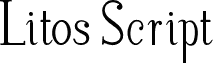
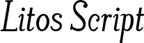
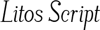
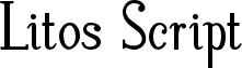
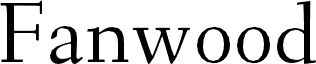
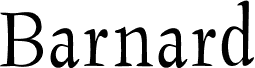
LitosScript by Decio Guanabarino of Guanabarino is a free high-contrast serif with poised, elongated forms. Its hairline strokes are exceptionally fine. Broad verticals and crisp, unbracketed serifs give the lettering a formal fashion-editorial air.
Magazine mastheads are its strongest setting, especially for fashion or arts publishing. The pronounced stroke changes also suit luxury packaging, cultural posters, and refined event programs. In editorial design, it can establish an elegant section identity across feature openers and recurring columns.
--
I am studying graphic design at UEMG (State University of Minas Gerais). I have worked as a photographer since 1999 and currently teach Image Editing, Project Development, and Experimental Photography at SENAI/CECOTEG.