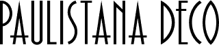
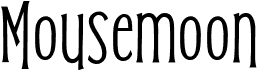
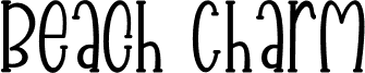
KG Two is Better Than One by Kimberly Geswein is a free retro display font with exceptionally tall, narrow letters and an easygoing handmade finish. The uneven stroke widths and softly bowed sides keep the forms lively rather than mechanically condensed. Loose joins and quirky curves recall painted neighborhood shop signs.
Its lanky silhouettes echo illustrated figures, making the lettering a natural part of character-led posters and children's book covers. For music flyers, the irregular line gives performer names a personal, slightly offbeat voice that feels drawn for the occasion rather than typeset. It also suits craft packaging and cafe menus.