Kaput Black Italic
TrueTypeUso personale
- Accenti (parziale)
- Euro
Kaput-BlackItalic.ttf
Tag
Nota dell'autore
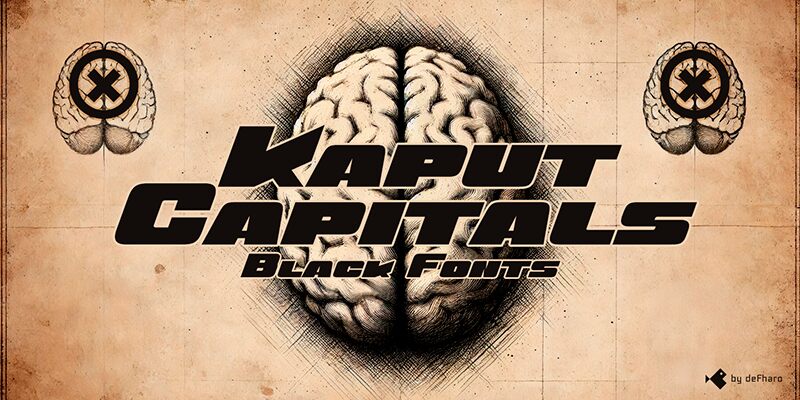
Kaput Black Italic is a unique sans serif typeface with a rounded finish on the outside, and combining curves with sharp angles on the inside, heavy and made in capitals, it comes to create great titles and high-impact visual communication.
OpenType Features: Various alternative letter and number sets, dynamic fractions, arrows, etc.
=========================
DOWNLOAD FULL VERSIONS & LICENSES: https://defharo.com/fonts/kaput/
=========================
OpenType Features: Various alternative letter and number sets, dynamic fractions, arrows, etc.
=========================
DOWNLOAD FULL VERSIONS & LICENSES: https://defharo.com/fonts/kaput/
=========================
Mappa caratteri
Si prega di utilizzare il menu a tendina per visualizzare le mappe di caratteri diversi contenuti in questo tipo di font.

Informazioni di base caratteri
Dichiarazione di Copyright
Copyright (c) 2024 by deFharo. All rights reserved.
Font famiglia
Kaput Black
Font sottofamiglia
Italic
Sottofamiglia unico di identificazione
Version 2.244;DFHA;Kaput-BlackItalic;2024;FL842
Nome completo del font
Kaput Black Italic
Nome tabella versione
Version 2.244
Postscript nome del font
Kaput-BlackItalic
Marchi di fabbrica
Kaput Black is a trademark of deFharo.
Fabbricante
Progettista
Descrizione
Kaput Black, a heavy and unique uppercase typeface family, is here to revolutionize the way we conceive great titles and high-impact visual communication.
Kaput is designed with a perfect balance between strength and sophistication, it is bold, semi-expanded and spectacularly legible, the thick lines and horns with marked contrasts, not only capture attention, but also provide meticulous harmony, thanks also to a thorough work on metrics and kerning.
Available in Black and Black Italic versions, the 20-degree inclination of the italic version adds a touch of dynamism and modernity.
Informazioni estese caratteri
Piattaforme supportate
PiattaformaCodifica
UnicodeUnicode 2.0 e poi semantica, unicode BMP solo
MacintoshRomano
MicrosoftUnicode BMP solo
Dettagli carattere
Creato2024-11-24
Revisione2
Contatore glifi243
Unità per em1000
Incorporare i dirittiIncorporamento limitato (non consentito)
Classe famigliaNessuna classificazione
PesoUltra grassetto
AltezzaExtra espanso
Mac styleSottolineato
DirezioneSolo fortemente sinistra a destra glifi + contiene neutrali
Disegno naturaCorsivo
InclinazioneVario