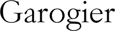
Garogier by Rogier van Dalen is a free high-contrast serif with graceful proportions and a distinctly calligraphic flow. Fine hairlines meet broad curves above softly bracketed and pointed serifs.
Its long, sweeping curves echo the clean contours of editorial fashion photography and finely drawn botanical illustration, making the typeface a thoughtful fit for magazine covers, fragrance packaging, and beauty campaigns. That blend of crisp contrast, tapered details, and gentle irregularity also suits literary publishing and classical music programs, linking these varied settings through lettering that feels cultivated yet visibly hand-shaped.