ÉconoSans Reduced 34 Thin Exp Ita
TrueTypeUso personale
EconoSansReduced-34ThinExpandedItalic.ttf
Tag
Nota dell'autore
ÉconoSans Reduced 34 Thin Exp Italic font is a light sans serif typeface designed by Ingo Zimmermann of ingoFonts.
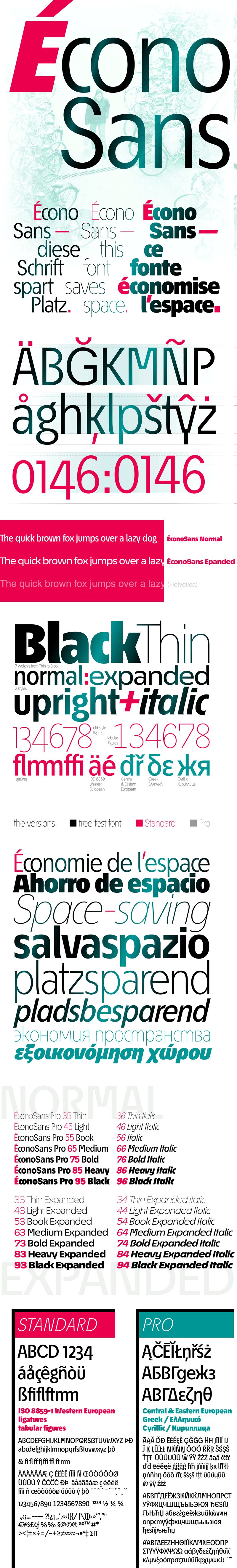
The most space-saving sans serif
Even the name of the font implies its function: French for the infinitive to save is conomiser. Now if that doesnt sound good
This font saves more space
than any of its kind!
Slim proportions,
but not condensed
Characters which nearly touch
Sparse ascenders and descenders
Distinct forms
How close to each other can the characters of a font get? Theoretically, as close as you want. But obviously, the words should still be legible. And as any designer knows, body clearance of characters also depends on other parameters such as point size and line spacing.
In practice, there are always situations in which as much information as possible has to be positioned in as little space as possible.
The ingoFont conoSans is made for exactly this purpose.
The shapes of the upper and lower case letters are completely matter-of-fact, the way a modern font has got to be. The letters c, e, and s are wide open to their neighbors. An especially distinguished trait of this font is the design of the triangular characters v, w, y, x, k, z and A, V, W, Y, Z, K, X, M, N. And the open form of B, R and P is also not typical in a sans serif.
The distance between letters is kept tight and often the characters nearly touch, but only nearly.
Results of a comparison*: With conoSans you gain approximately 20% more text in a line than with Tahoma, and even still more than 10% compared to Helvetica Neue, not to mention the old normal Helvetica
* In order to truly compare, the fonts were measured up to the same visual size, i.e. conoSans 12 pts, Avenir Next 12.5 pts, Bell Centennial 12.5 pts, Helvetica 11 pts, Tahoma 11 pts.
In addition to the normal figures, conoSans also includes tabular figures with unvarying width as well as ligatures (character connections). Among the ligatures, the double mm is especially unusual and is hardly familiar, but can contribute greatly to saving space without catching the readers eye.
Tabular figures and ligatures can be turned on and off by means of the corresponding Open Type functions of the user program.
The font downloadable here is a reduced version (without punctuation, ligatures, numbers etc.). A commercial version of this font (with all features) is available at www.ingofonts.com.
Mappa caratteri
Si prega di utilizzare il menu a tendina per visualizzare le mappe di caratteri diversi contenuti in questo tipo di font.

Informazioni di base caratteri
Dichiarazione di Copyright
Copyright (c) 2016 by Ingo Zimmermann. Alle Rechte vorbehalten.
Font famiglia
EconoSans Red Thin Exp
Font sottofamiglia
Italic
Sottofamiglia unico di identificazione
Version 3.015;ifon;EconoSansRed-34ThinExpIta;2016;FL714
Nome tabella versione
Version 3.015
Postscript nome del font
EconoSansRed-34ThinExpIta
Fabbricante
Progettista
Descrizione
Copyright 2016 by ingoFonts Ingo Zimmermann, Augsburg. All rights reserved.
Informazioni estese caratteri
Piattaforme supportate
PiattaformaCodifica
UnicodeUnicode 2.0 e poi semantica, unicode BMP solo
MacintoshRomano
MicrosoftUnicode BMP solo
Dettagli carattere
Creato2016-07-11
Revisione3
Contatore glifi53
Unità per em1000
Incorporare i dirittiIncorporamento per l'installazione permanente
Classe famigliaSenza terminazioni
PesoUltraleggero
AltezzaMedio espanso
DirezioneSolo fortemente sinistra a destra glifi + contiene neutrali
Disegno naturaCorsivo
InclinazioneVario
Pack completo contiene 28 font di seguito elencati:
EconoSansReduced-34ThinExpandedItalic.ttf
EconoSansReduced-43LightExpanded.ttf
EconoSansReduced-76BoldItalic.ttf
EconoSansReduced-54BookExpandedItalic.ttf
EconoSansReduced-93BlackExpanded.ttf
EconoSansReduced-45Light.ttf
EconoSansReduced-35Thin.ttf
EconoSansReduced-63MediumExpanded.ttf
EconoSansReduced-64MediumExpandedItalic.ttf
EconoSansReduced-66MediumItalic.ttf
EconoSansReduced-75Bold.ttf
EconoSansReduced-53BookExpanded.ttf
EconoSansReduced-84HeavyExpandedItalic.ttf
EconoSansReduced-36ThinItalic.ttf
EconoSansReduced-56Italic.ttf
EconoSansReduced-55Book.ttf
EconoSansReduced-94BlackExpandedItalic.ttf
EconoSansReduced-73BoldExpanded.ttf
EconoSansReduced-95Black.ttf
EconoSansReduced-96BlackItalic.ttf
EconoSansReduced-83HeavyExpanded.ttf
EconoSansReduced-46LightItalic.ttf
EconoSansReduced-65Medium.ttf
EconoSansReduced-86HeavyItalic.ttf
EconoSansReduced-33ThinExpanded.ttf
EconoSansReduced-85Heavy.ttf
EconoSansReduced-44LightExpandedItalic.ttf
EconoSansReduced-74BoldExpandedItalic.ttf
ÉconoSans Reduced 43 Light Expanded
TrueTypeUso personale
ÉconoSans Reduced 76 Bold Italic
TrueTypeUso personale
ÉconoSans Reduced 54 Book Exp Ita
TrueTypeUso personale
ÉconoSans Reduced 93 Black Expanded
TrueTypeUso personale
ÉconoSans Reduced 45 Light
TrueTypeUso personale
ÉconoSans Reduced 35 Thin
TrueTypeUso personale
ÉconoSans Reduced 63 Med Exp
TrueTypeUso personale
ÉconoSans Reduced 64 Med Exp Ita
TrueTypeUso personale
ÉconoSans Reduced 66 Medium Italic
TrueTypeUso personale
ÉconoSans Reduced 75 Bold
TrueTypeUso personale
ÉconoSans Reduced 53 Book Expanded
TrueTypeUso personale
ÉconoSans Reduced 84 Heavy Exp Ita
TrueTypeUso personale
ÉconoSans Reduced 36 Thin Italic
TrueTypeUso personale
ÉconoSans Reduced 56 Italic
TrueTypeUso personale
ÉconoSans Reduced 55 Book
TrueTypeUso personale
ÉconoSans Reduced 94 Black Exp Ita
TrueTypeUso personale
ÉconoSans Reduced 73 Bold Expanded
TrueTypeUso personale
ÉconoSans Reduced 95 Black
TrueTypeUso personale
ÉconoSans Reduced 96 Black Italic
TrueTypeUso personale
ÉconoSans Reduced 83 Heavy Expanded
TrueTypeUso personale
ÉconoSans Reduced 46 Light Italic
TrueTypeUso personale
ÉconoSans Reduced 65 Medium
TrueTypeUso personale
ÉconoSans Reduced 86 Heavy Italic
TrueTypeUso personale
ÉconoSans Reduced 33 Thin Expanded
TrueTypeUso personale
ÉconoSans Reduced 85 Heavy
TrueTypeUso personale
ÉconoSans Reduced 44 Light Exp Ita
TrueTypeUso personale
ÉconoSans Reduced 74 Bold Exp Ita
TrueTypeUso personale