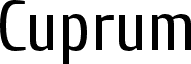
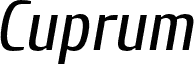
Cuprum Bold Italic, designed by Jovanny Lemonad, is a free condensed sans serif with a forceful forward slant. Its tall, tightly drawn letters combine broad vertical strokes with sharper joins and noticeably changing stroke widths. The result feels brisk and assertive, but the narrow proportions keep the lettering controlled.
Sport, transport, and fast-moving editorial subjects match its sense of speed and compact build. It is especially convincing on event posters, magazine covers, and team merchandise, where the slant supplies motion and the dense silhouette remains substantial. For automotive or athletic branding, those same features can turn a name into a purposeful badge-like product identity.
--
Cuprum was created in 2006 based on the work of Miles Newlyn. Cuprum is a narrow grotesque typeface. The name refers to copper rather than gold or silver.
This collection of libre fonts was created by designers who have allowed everyone to use, share, modify, and improve the fonts free of charge. Donations support the treatment of children with cancer.
To donate, send a payment to:
Yandex Money: 41001412092310
PayPal:
lemonad@jovanny.ru
Enter “Donate” in the payment description.