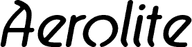
Aerolite Bold Italic by Jan Paul is a free retro display font with broad, slanted letters and smooth, swelling strokes. Rounded joins and clipped inner shapes give the alphabet a distinctly 1970s space-age look. The forms feel quick and elastic.
On record sleeves and music posters, its forward lean and unusual curves turn lettering into part of the artwork. The same traits suit festival graphics and fashion packaging. In editorial design, it is especially apt for features about vintage pop culture, electronic music, or retro-futurist style.
--
Aerolite © 2010 is a font family designed by Jan Paul and digitized by Brian Kent in New York.
The font family was developed for the Midnight Oil album “The Blue Meanie” and has since been associated with surfing.
- Six OpenType fonts
- Six TrueType fonts
- Extensive kerning
Aerolite is free for personal use. For light commercial use, please make a donation in the provided box. For major commercial work, contact Jan Paul at:
graphique@gmail.com
The basic character set contains 196 glyphs and provides accented characters for common foreign languages. An extended set supporting 65 languages is available at:
https://www.cheapprofonts.com/Aerolite_Pro_Regular.php