2 Prong Tree
TrueTypeFreeware
2PROT___.TTF
Tag
Nota dell'autore
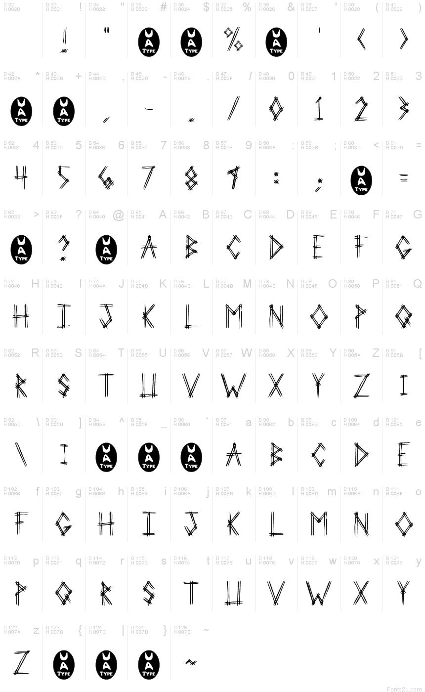
2 Prong Tree is a captivating script font designed by Ben McGehee. With its bold, angular strokes and distinctive "tree-like" shapes, this typeface exudes an undeniable sense of edginess and unconventionality. The "trash" style lends it a raw, gritty aesthetic that would be well-suited for album covers, concert posters, and other high-impact design projects.
The font's striking visual identity makes it a versatile choice for a wide range of applications. Its dynamic, almost kinetic appearance could breathe new life into branding initiatives, while the font's bold, assertive personality would complement experimental typography and digital art. Whether employed for headlines, logotypes, or decorative accents, "2 Prong Tree" promises to leave a lasting impression on viewers.
The font's striking visual identity makes it a versatile choice for a wide range of applications. Its dynamic, almost kinetic appearance could breathe new life into branding initiatives, while the font's bold, assertive personality would complement experimental typography and digital art. Whether employed for headlines, logotypes, or decorative accents, "2 Prong Tree" promises to leave a lasting impression on viewers.
Mappa caratteri
Si prega di utilizzare il menu a tendina per visualizzare le mappe di caratteri diversi contenuti in questo tipo di font.

Informazioni di base caratteri
Dichiarazione di Copyright
Another Freeware font from UnAuthorized Type
Font famiglia
2 Prong Tree
Font sottofamiglia
Regular
Sottofamiglia unico di identificazione
Macromedia Fontographer 4.1 2 Prong Tree
Nome completo del font
2 Prong Tree
Nome tabella versione
1.0 (5/24/97)
Postscript nome del font
2ProngTree
Marchi di fabbrica
UnAuthorized Type
Fabbricante
Progettista
Descrizione
This version includes only capital letters, and some commonly used punctuation. plus the new UA Type dingbat (just to amuse myself).
When I was sitting in Huddle House one night, drinking coffee, I was showing my girlfriend the fonts I was working on. I drew out 3-Prong Tree, and she said that she didn't like it. She told me to do it with just 2 lines on every letter. So I tried that with this one.
She realized after the finished product of 3-Prong Tree that it was good, but I went on and did 2-Prong Tree just to see the difference. 3-Prong looks better at smaller point sizes (because it's fatter), but 2-Prong Tree looks better at larger point sizes (because the letters are cleaner).
Informazioni estese caratteri
Piattaforme supportate
PiattaformaCodifica
MicrosoftUnicode BMP solo
MacintoshRomano
UnicodeUnicode 1.0 semantica
Dettagli carattere
Creato1997-05-24
Revisione1
Contatore glifi110
Unità per em1000
Incorporare i dirittiIncorporamento limitato (non consentito)
Classe famigliaManoscritto (scritto)
PesoMedio leggero
AltezzaMedio condensato
Tipo altezzaNormale
Mac styleGrassetto
DirezioneSolo fortemente sinistra a destra glifi + contiene neutrali
Disegno naturaRegolari
PosturaDritto
Peso colpoLibro, testo, regolare, etc.
InclinazioneVario
Set simboliWindows 3.1 ANSI